Throughout the first semester, Upper School fine arts students worked diligently in visual arts classes, creating everything from drawings to clay bowls. The Evergreen spoke with several art students about their pieces and the process that they took to create them.
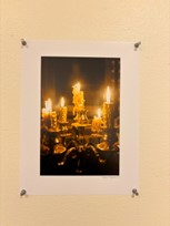
August Nguyen – Photography 1:
“The candles had already been lit from the day earlier. So, whenever I walked downstairs, I saw that the wax was in all different shapes and looked really interesting. Then, I decided it would be a good idea to light them again and take a picture. For editing purposes, I decided to make the part with the light brighter and then the shadows darker to give the photo more contrast. This way, you could really tell which parts were being lit and which parts were dark.”
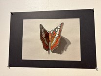
Ana Blankson – Drawing 2:
“The assignment was to draw a realistic insect of our choosing with colored pencils. We had the option to use various papers, including black, and to be creative. My process for choosing my piece was I wanted to do a colorful insect that challenged my artistic abilities and was out of my comfort zone. My art piece is three-dimensional because I had to figure out how to incorporate both sides of the commander butterfly’s beautiful wings into my piece. Overall, I love this project and think it was a really great opportunity to try something new.”
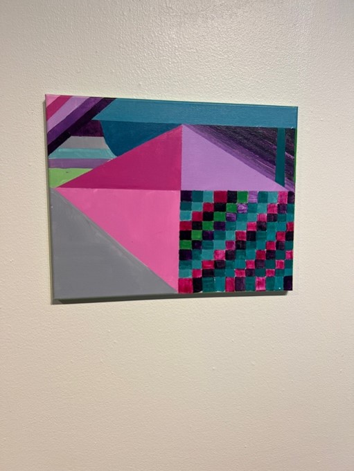
Gigi Melucci – Painting 1:
“The assignment was called “Geometric Abstraction,” and our goal was to use different shapes and colors to portray an emotion. I decided to use duct tape to help map out my design and produce straight, clean lines. I also worked on using strong contrasting colors that worked well with the subject matter of choice.”
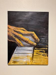
Oliver Burke – Painting 2:
“This painting was inspired in part by a friend of mine, Ali Agha, whose passion for music and the piano is palpable. This was the continuation of my series on hands involved in music, and I tried to focus on achieving a stark contrast between different highlights all to bring out the emotion indicative of being truly caught up in the music you are playing. I didn’t really have a specific process for creating this piece, rather I just focused on trying to capture a feeling rather than an image. I chose to not fill in the painting near the bottom of the piece to show that music is not a finished product, and to show the idea that as music is played, an image is created.”
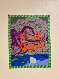
Harshdeep Bommareddy– Design 2:
“My first idea was to create a series of movie posters depicting large monsters, as this was a topic that was highly interesting to me. My first thought was, “‘Which monster could I draw well and really convey a message to the viewer?’” I also took into consideration what would be fun for me to draw. I decided on the Kraken as the first movie, as the complexity of the creature would be a good challenge to draw and really immerse the viewer into the art. Overall, this was only one of three pieces in the sequential series, but it was by far the one that popped out the most and the one that I spent the most time on.”
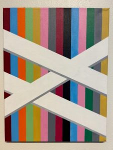
Liam Fagelman – Painting 1:
“This is a geometric composition incorporating the basic elements of design and using basic color theory. I thought that the way that colors were altered to the eye when placed next to each other was an interesting concept. I wanted to see for myself if I could achieve that. I strategically placed painter’s tape in vertical lines to create clean edges. I started with the white bridges and then layered on the background lines from left to right.”
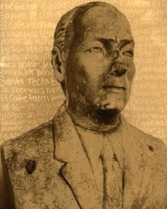
Cassie Rosa – Honors Photography:
“The statue in the photo is from the alcaldía, or the city hall, in Santa Tecla, El Salvador. For this photo, I took a lot of creative liberties, representing the influence he had on the city. He donated many important buildings and was a major benefactor helping shape the city’s future.”
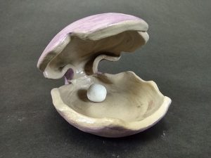
Vicky Cisneros – Sculpture 1:
“For this assignment, it was to make something out of a slab of clay. So, with that in mind, I sort of had to narrow down what I could do with that. I remember seeing a clam shell lamp that looked cool, so I ended up taking that idea and making it my piece for that project. The process was surprisingly easy. I used bowl molds to make the top and bottom parts. To connect them, I put a sponge in the middle of it to keep it open until it was dry.”
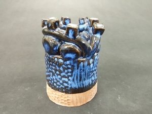
Siena Richey – Sculpture 2:
“The assignment for this piece was to make a structure built with coils but had designs and different patterns built into the piece that separated the coils from the shapes at the top. My process for this piece was beginning with small coils and I altered about six or seven coils on top of each other and then smoothed out the coils to blend them. Then, I added the extra pieces on the top that stand out to give it more originality. After my piece was fired, I dipped the piece into a combination of different colored glazes and was pleasantly surprised with how it turned out. I am very happy with the pigmented finish of the glaze and how the piece is now two colors that fade in and out of each other.”
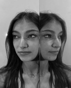
Shaina Starr – Honors Photography:
“This photo is a self-portrait which shows the necessity of reflecting. I used a mirror panel to reflect the side of my face to show the importance of taking time to reflect on my true self. My goal was to show that looking back is beneficial for moving forward.”

